ComFest, or more formally Community Festival, is a free three day event, typically held the last weekend in June. The only exceptions are years where, oddly enough, Goodale Park has rented itself out to some other function, like for example a wedding (see: 2000, 2008). You would think about 50 years of this they might say, sorry, this weekend is booked, but apparently not.
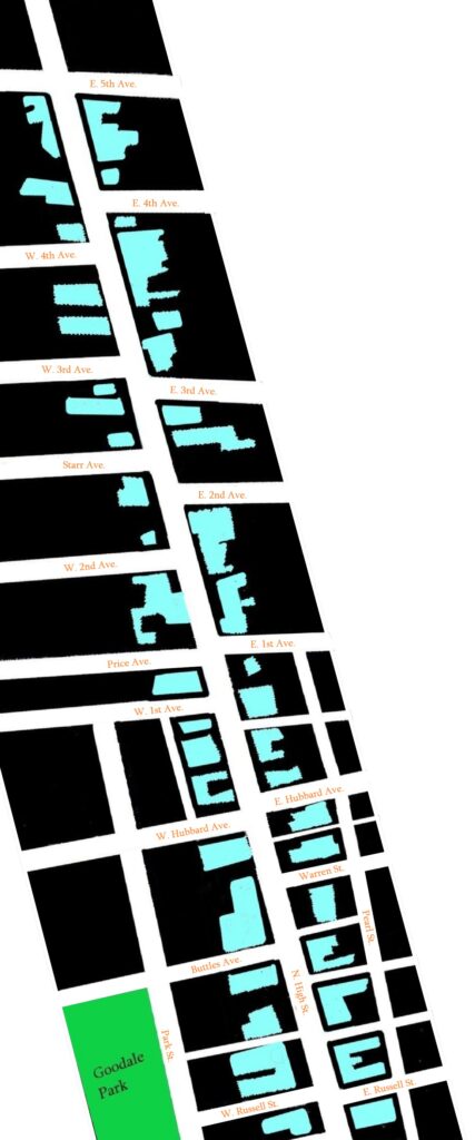
Even these loose facts haven’t always been the case, however. Originally conceived of in 1972, as a volunteer driven, non-corporate event, the first iteration was held on OSU campus, at that funky triangular intersection where E. 16th Avenue meets Waldeck, running along both of those streets. The dates bounced around quite a bit back then, and as of the mid 80s they were still hosting this thing in August. In 1983 the organizers moved instead to a vacant lot in the Short North, at the intersection of High & Russell. Finally, after ten years there, during which time the event truly blossomed and expanded from one stage into many, the sideways shift over to Goodale Park was undertaken in 1993, where it has remained ever since.
Video was a huge part of the earlier incarnations, too, on equal footing with the live music. This seems surprising, but like in this awesomely primitive program I’m looking at from 1973, there are by my count 17 performers listed (including Saturday night headliner Rahsaan Roland Kirk!) on the lone stage, but over at the UCC lawn, different films/TV segments are aired continually, most either 30 minutes or an hour long. Among these are a couple called Video Freak Games that certainly sound intriguing. And then at 1:30am on both Saturday and Sunday, it’s an all-night movie fest over there.
The programs themselves have undergone a radical transformation, too. Earliest editions have that whole typewritten zine look about them, with some segments clearly (i.e. physically) pasted in, which you can tell because they might be slightly crooked and/or display faint lines where this patch was glued into place. But man does that look mighty freaking cool, the standard old typewriter font (I believe this might be known as Courier New, at least nowadays) and double or triple spaces galore.
Then we move into the middle years. I like the covers on the 1989 and 1990 editions, some of the first stabs at getting a bit more colorful. Much like the Playboy bunny rabbit, this is part of a nice little stretch where the official Comfest logo is somewhat hidden within the artwork somewhere. In ’90 they even list the performers for all three days on the cover, and might be the best looking one I’ve seen up to this point. After that, though, I’m not sure what happened, they may have run into a wee bit of a funding issue – things took a turn back toward the more primitive there for a while. 1994 does at least feature some black and white photography, which will persist until 2000. Since that time, every year that I’m aware of has featured distinct, progressively more and more colorful artwork, most of which has looked awesome. As far as these go, I’ve liked the simplicity of the ’04 design, the hippie van of 2010, and the blood red, vaguely revolutionary bent of the 2017 program.
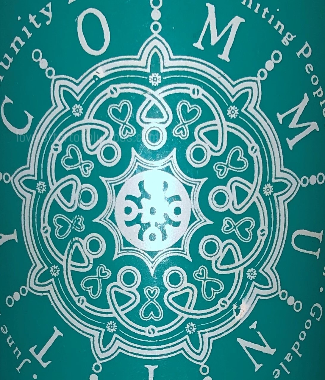
Well, okay, that’s all I have for now. I don’t want to get too deep into covering individual years here, because I plan to have standalone pages for each. So far, though, I’ve only finished three. You can click on each of them in the image below, which has the official 2004 beer mug as its backdrop. Enjoy!
