This picture below is actually such a hilarious cross-reference of various threads and eras that I could get sidetracked for days merely discussing all contained within. I guess this is a good example of how when you meet people for the first time, you often have no idea what the hell they are even talking about, though it makes perfect sense to them. This is why we get sidetracked, and have trouble sticking to the script.
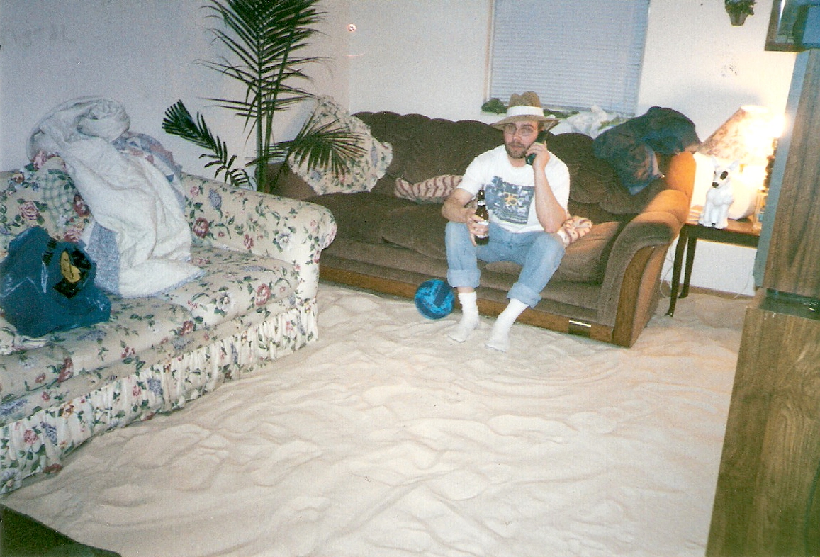
But I mean, with all due respect to the five people depicted in this photo, who were if nothing else quite obviously present for the night in question, and all the other fine folks who attended…none of us are typically the first subject on anyone’s lips when somebody mentions this night. Nor for that matter are the strange complementary touches visible elsewhere around them. The floral print couch and lamp are from a previous girlfriend (Jill) who is not on hand for these festivites…Megan here one of just two people, apart from Damon and me, who paid any mind whatsoever to our directives about dressing tropical (Robin’s blonde friend Tammy, not Damon’s coworker Tammy nor my blonde coworker Tammie, is the only other), never mind the snow outside…there’s a disco ball mounted here, as ever, which was an Xmas present from my brother a few years earlier…the unmistakeable Keith Richards and Andy Gibb photos flanking the NO DRUGS sign that Damon and I scored from this blues festival where local musician A.C. Collins just about lost the plot, mid saxophone solo, when we shook this in his face…this lawn chair present in the middle, which I kind of remember was always around even as I can’t tell you where it came from or what this is doing here…the stripper’s name (“Crystal”) hand painted in bleach, an incident which I’ve written about elsewhere…some weird Jesus print, I think, behind Megan, which must have been one of Damon’s decorating flourishes.

But yes, otherwise, we must address the matter at hand: this infamous sandbox party. Which turned into a sandbox apartment, for roughly the next 8 months or so, after the party was over.
What happened is that, after years of jokingly suggesting such, Damon and I finally went ahead and purchased a bunch of sand bags, then dumped them in our living room and invited everyone over to our beach party. This happened in our northside apartment at 1855 Oak Grove Court. To be precise, we acquired 15 bags that were 50 lbs apiece – so yeah, 750 pounds of sand is what you’re looking at here. And then some potted palms, a volleyball net, and other complementary pieces to accompany this theme.
“See, I’m glad you remember exact details like that,” Damon said, not so long ago, when this subject recently reared its head.
But the photos certainly help. Otherwise even I might have much less concrete evidence available, for documenting this infamous occasion. The ones I’m posting here are merely the safest surviving copies, on a cold March night where some of these girls were in a naughty, skin baring mood. Also even characters as prominent as Big Paul’s future wife have effectively said, “get outta here!” when told about this party, subsequently, as though not quite believing it, and it’s great to have proof for those people. To get back to the basics, though, let’s begin with how this bash even came about.
So yeah, after obliquely informing our usual cluster of suspects about this event, Damon and I went and purchased this sand from a home improvement store at Easton. We didn’t mention specifics, however, only advised people that they should DRESS TROPICAL. As we then preceded to crank up the heat, threw on Hawaiian shirts and/or shorts ourselves (Damon appears to have gone with rolled up pant legs,) despite the snow outside on this mighty frosty night. Yet Clif here is obviously wearing long sleeves, so is Andy C., and this appears to be before our apartment was crammed elbow to elbow with an unfathomable amount of people, raising the temp even higher.
I say unfathomable because this is another weird aspect of this party: the number of attendees. I guess a handful of times in life, things work out even better than scripted (or should we say, this time around, perfect despite the complete absence of a script) and this is one of the top few occasions I can think of. These parties are always tricky monsters to nail down. Sometimes you invite a ton of folks, and relatively few of them show up. Others, you invite almost no one, but wind up with a mountain of guests.
This occasion certainly falls into the latter camp, though even so is more than a little extreme. Damon has gone on record saying he can’t recall inviting all that many people – and I will take this further, confident that I told almost no one about this party. Yet it wound up as, with complete seriousness, the most jampacked sea of bodies I’ve ever personally experienced at any of my residences, for any reason whatsoever. Then you begin parceling out the particulars of who did/didn’t make it, and the whole enterprise becomes even weirder.
Damon wasn’t even banging Megan yet, but she is here; meanwhile his current “girlfriend” Maryland is in attendance, though they are in a rocky patch and don’t even interact much; either two or three of the women I am involved with (depending upon your definition of the word “involved”) will show up, but, I would argue, not the top two or three I am most involved with or starry eyed over at this time. Yet still, this litany of attendees is mind-blowing, even in consideration of the strange gaps. People I haven’t seen since high school, some eight years prior, are inexplicably here. Our dearest friend Paul Radick is not, however. Andy Carpenter somehow made it, but at the opposite end of this limited spectrum, my memory is that Damon, me, Andy, and Chris Nicholson all attempted to persuade Matt Wackerly that he really should make the short drive down from Mansfield, and were unable to convince him.
So let’s get down to specifics. After dumping the sand in our living room and decorating accordingly, Damon and I crack open beers, sit around with not-quite-bated breath to witness who exactly might venture through these doors. We purchased two 12 packs of MGD, two giant bottles of cheap vodka for daiquiris, have a sports cooler filled (meaning a spout on the side for handy sipping) with some Hairy Buffalo type concoction, and also a bottle of Jim Beam (Bill) and Jack Daniel’s (Maryland) that a couple people have given us. Most of the attendees will of course bring their own spirits as well.
Paul Linville is one of the first to show, taking one glance at us and declaring this reminds him of a Hunter S. Thompson novel – and this is before he even notices the sand all over the floor! Arriving with Chris Nicholson (who has at least visited this apartment prior,) Andy Carpenter has never been to any of our collective Columbus residences, before tonight. He in turn is the one who invites our old friend Kara. This wasn’t even our doing. Yet she shows up looking as cute as always, in a low cut orange top, tight jeans. Though gasping like many others when she first sets foot in this apartment, and that blast of cranked up heat hits her face.
With her she has brought sister Kristen, as well as Dave Ekegren, whom I barely even know, and his fairly hot Asian girlfriend; Clif shows up with this chick he is seeing, Alena, along with this goofy Chris kid in a hockey jersey. Maria and Jen F are here, the former doting upon the Chris in question. Andy Knuckles, who works at the Chambers Road Kroger, and his dark skinned lady friend, who manages the rare combination of beauty and personality with aplomb. The near constantly conjoined trio of Alan, Tawnya, and Megan; a bunch of Damon’s coworkers; Robin and some of her chums; Maryland, Joselyn, and this idiotic wigger who insists upon our calling him Big Willie Style, along with a trio of other punks we don’t know; Melissa, Ann, Melanie – and the list goes on and on.
Yet among the most intriguing attendees might be this pair of chicks we only met at Traditions the night before, right around closing time. Their names are Donna and Michelle, and though knowing them for less than five minutes, before tacking on a half-assed invite as we were leaving, here they are. Michelle is a stunning blonde with vaguely stripper-esque vibes, who hits it off bigtime with Maryland somehow (they are both among those who flash their tits, in tandem no less in at least one shot, for various amateur photographers tonight,) while Donna…hmm, to put it kindly, is not much to look at. Yet she volunteers to play bartender for everyone, the entire night, and proceeds to do just that. To the extent we totally fry our own blender, at which point one of Robin’s friends, who happens to live in this same apartment complex, runs to retrieve hers. And keeps this party moving without so much as a hitch.
But there’s one exceedingly strange aspect to Donna’s appearance here, which begins before she even arrives. When Big Paul showed up, he and Damon busted out the acoustic guitars, and started picking around. For whatever reason, they are on this big Neil Young kick at the outset, and are playing his tunes far more than any others (actually I’m wondering now if Cowgirl In The Sand was in that setlist, and if not, how they could have possibly avoided it.) Well anyway, when Donna gets here, having just arranged the blender and liquor ever so in our kitchen and firing up some of her first drinks, these two are at the kitchen table still with their acoustics. They continue the Neil trend right away by jumping into I Don’t Want To Talk About It (technically a Crazy Horse number, minus Neil – later made famous by Rod Stewart) and Donna whips her head around, with a gasp, exclaims, “my uncle wrote that song!”
So yes, she begins to explain: Danny Whitten was her mom’s brother. Though these other two continue picking without pause, I’m pretty floored by this revelation, consider it extremely spooky. Explaining further, everything she tells me will later check out as legit, including her mom’s name and so on – so although it’s possible this was all bullshit, it seems like a mighty weird thing to make up on the spot, and we tend to believe her.
Damon’s grandma calls, in a disguised voice, to ask whether it’s okay to show up topless – guess we can see the genetic roots for his own similarly mischievous side, heh heh. With each wave of attendees, mobilization becomes less possible, as bodies are expelled deeper into the house, against walls, into corners. A running tab of who’s here only navigable to a point, conversations eventually restricted to those within touching distance of the elbow you can barely move.
Bill leaves early, after just two daiquiris…Robin and Amber show up with a cooler, a birthday card for Damon (today is his 26th!) and a cake, leave, return…sitting on a cooler talking to Knuckles & his old lady…I smack Michelle on the ass, in passing, which she seemingly digs – yet is way more impressed by these idiots who showed up with Maryland, so go figure…Carpenter and Alena, as far as I can tell, are the only two people here who aren’t drinking.
At some point, Damon and Paul move upstairs to continue jamming in the bedroom that, curiously enough, belonged to each of them at one point. Nicholson spends about three solid hours trying to shmooze this chick he’s interested in, upstairs, I think in what must have been my bedroom. Although I too have my regrets about this party, to some extent, I am nonetheless definitely not sure their approaches make sense in a setting such as this. And Damon will later admit he thinks this was really stupid, to spend hours sequestered up there playing guitar, for a relatively small audience, instead of mingling with the masses. Meanwhile, during their long ride home, Carpenter berates Nicholson for spending that much time working his target, and being stoked about the results…without even getting her phone number.
“You idiot!” Andy purportedly tells Chris, “you spent three hours talking to that chick and didn’t even get her phone number?!”

In concurrent developments, the other known Chris who was here, Clif’s coworker, he leaves with Maria and Jen, allegedly to hit DiMarco’s first and then who knows what kind of development afterwards. Clif is so intrigued by this that he dials Chris’s number for the down low. Although Chris denies having slept with Maria at the conclusion of this evening, the rumor shall persist for quite some time.
As for me, my aforementioned regrets revolve around not making the most of this golden opportunity, even though I am actually on the ground floor socializing this entire time. In my defense, you might say mobilization is a major challenge, and you’re often stuck just talking to whomever happens to be in your immediate wheelhouse at this moment. However, I know deep down it’s lame to blame any of my results upon this, because my attitude kind of sucks, and that this is the real culprit.
In a nutshell, I’m in this mood where I don’t really care about anybody who has actually made it here, because all I can think about is who’s missing. Despite not actually inviting them, it’s true, which is all the more absurd. Robin will even email the next day to ask me what my problem is and why I treated her so badly at this party. But I think many of us have been guilty of this before, failing to appreciate what’s here and who made it, obsessed instead with who dared to diss your cookout or birthday bash or whatever – I didn’t mention this to anyone whatsoever, though if I’m being honest, this was totally my mindset.
Therefore this is an event which would only seem hilarious to me as the days and months pass, because in the moment I’m somewhat going through the motions. As preposterous as this seems when confronted by the evidence, this sea of people, the volleyball game in the living room, the endless flow of tropical drinks. The chicks flashing the camera, the pictures. I do think things have been going so well for us here, for a number of months, that cockiness was becoming an issue – and so maybe the occasional reset was not only in order, but an inadvertent blessing. I mean, how ridiculous is this? Can you rightly even claim somebody “dissed” you when you’re on some high horse, thinking they should show up anyway, via word of mouth, because you’re too cool to call them? And as previously mentioned, extremely indifferent to some chicks you actually are involved with, ones who did make an appearance.
There’s at least one other what the fuck were you thinking? moment, where I subsequently kick myself for not following through on a sweet proposal falling into my lap. Ann at one point winds her way downstairs and into my semi-circle in the kitchen, where she will remain wedged for quite some time. She’s looking positively dynamite tonight, yet attainable somehow anyway, with her pursed, pouting lips, bright blue eyes and engaging smile, her scientifically perfect posterior tucked into tight jeans. Also, in a comedic, down to earth touch that somehow seals her divinity, a 1970s model shirt, black but with long white sleeves, with the Fantastic Four logo on the front and the word PLAY emblazoned across its back. There for a while, it’s just the two of us talking, and she eventually comes right out and mentions that we should get together sometime.
Instead of embracing this concept, I’m in this scoffing frame of mind where I’m basically thinking, yeah whatever, who cares, I’m sure nothing would come of this anyway. And as a result not only fail to make plans right now, but fail to ever call her, because instead I feel the need to come up with reasons why this would never work.
“Yeah, it would be cool,” I tell her. “We can’t, though. One of your friends would be very upset.”
She seems somewhat suprised yet amused by this answer, as her luscious lips part only slightly, enough to induce her famed dimpled smile. “I know which one you mean,” she eventually says, “I remember that one night when you two disappeared, and I was like, where did they go?“
I chuckle at this anecdote, though cautioning her, “don’t tell Damon, though.”
“He doesn’t know?” she exclaims, puzzled initially by this revelation. “He was there…oh, that’s right, he was passed out on the living room floor…”
In my defense, comparing notes later, Damon will admit to making virtually the exact same mistake. He says he too was pinned in a one-on-one with Ann for a relative eternity – in this instance the tiny upstairs hallway – and although she didn’t come right out and ask him, felt like she was slathering on the flirtations with a very thick spoon. Which he also failed to capitalize upon.
And I guess he’s also not having the greatest night. Squabbling with Maryland, lamenting that he didn’t make more effort to socialize. Then, as the party was still going mighty strong yet had at least compressed itself to the ground floor later, merely shutting off his light and calling it a night, without saying goodbye to almost anyone. As for me, this party is maybe the rare exhibit we could present, an exception for those fond of claiming, “man, that dude isn’t bothered by anything!” Obviously this could never be true of anyone, but I do feel like less and less has gotten to me as the years have passed – and times like these have only pushed me farther out onto that ledge, feeling bad afterwards and vowing not to let this happen ever again.
As bodies begin to break up and leave, Kara finds her way over to me, stranded in the kitchen still, and apologizes for “leaving so early.” The funny thing about this, though, is I glance at the clock above our central command post of telephone/answering machine/caller ID, and can see it’s basically midnight. Yet play along anyway and feign extreme disappointment.
“I’ll make it up to you, though,” she says, “would you like to go out to dinner sometime?”
“Okay,” I shrug.
“I’ll hold you to it,” she smiles, before that entire miniature crew splits.
As Tammy and Dragon are taking off, he actually pecks me on the cheek – ah, those crazy Macedonians! Then in another example of something I truly do not care about, Donna jams her tongue down my throat before splitting, saying, “come see me at Traditions sometime,” as if I need any more encouragement to visit my virtual second home. I’m guessing this was in response to something I said earlier about wanting to kiss her, though it does take me by surprise. I wouldn’t exactly claim this is a career highlight or anything – but if nothing else, at least I can tell people I locked lips with Danny Whitten’s niece.
An afterhours scene is developing over at Maryland’s pad, which is only maybe five or ten minutes away from here. Though I could have readily gone myself, joining many from this party who did, it’s also something I’m just not in the mood for. We will soon discover, however, that she and Michelle surreptitiously cleared out our liquor cache to supply their own cause, right before bolting.
The last handful of stragglers among us will square off in a guys vs. girls strip volleyball game – my team lost, yet I suspect if the girls were behind and had to shed any more clothing, the game would have ground to an immediate halt anyway. Alan, Tawnya, and Megan are the last three guests remaining, chilling out with me on actual furniture, while I’m reclining in the sand. Then they take off, and despite how astronomically unlikely this would seem, given our recent hot streaks and what an objectively wild night this has been, when I too head upstairs, my roommate and I have both somehow managed to pass out in our own beds, accompanied by no one, with not a single other soul crashing anywhere in this house. No wait, it seems I have that slightly wrong: my notes say Big Paul passed out on one couch. Still, this too is poetic justice, considering he was my first roommate here, and his presence wraps this entire era/episode up with a tidy, flower patterned bow.